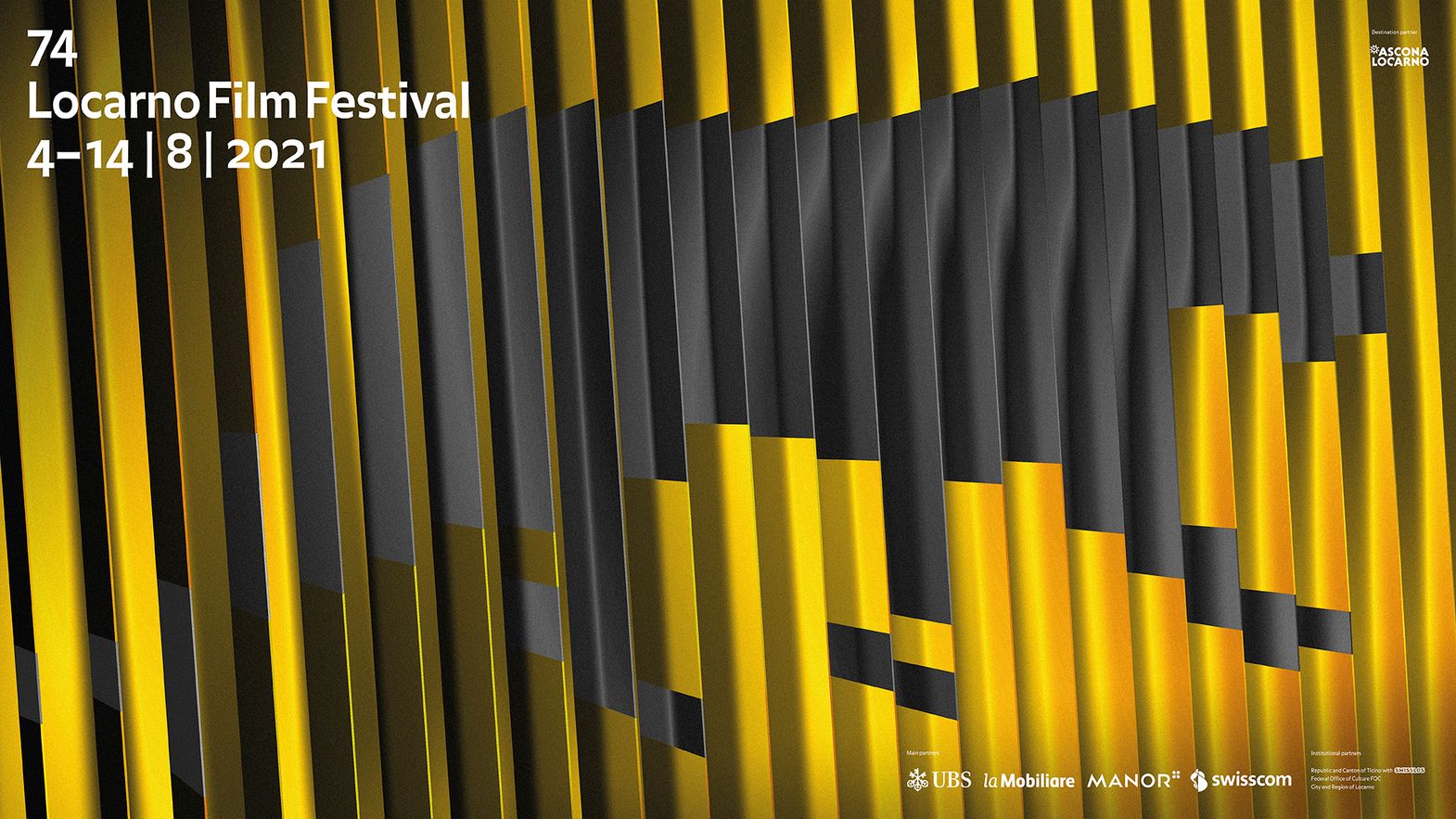
You can’t resist the leopard. That is kind of what Luciano Baragiola thought of when he started working on his idea for the Locarno74 poster. And his idea, one in a thousand, won. The Lugano-based designer, who was born in 1980 and founded the studio favon.io, won the contest for the authoring of the official image of the next edition of the Locarno Film Festival, a contest that attracted 901 entries from 85 countries spread across the five continents. His idea was to split the leopard in 24 parts. Luciano explains: «It’s the basic concept of cinema, the 24 frames per second that fool the human eye and create the illusion of movement. It’s the graphic concept of what is technically the magic of filmmaking.»
So there is poetry involved as well…
«Speaking as a trained engineer, I’d call it technique. But there is indubitably room for poetry too, much like art hiding within science.»
How did you face the challenge of designing the Locarno poster?
«(Laughs) By having an absurd month. When my colleagues at Spazio Cromo in Lugano and myself saw the call for entries we thought ‘Cool, but incredibly hard’. You had to tackle a cultural institution with an important history and its emblem, the leopard, which has gone through reinventions for decades… That said, it was too fascinating to pass up and we encouraged each other to participate. Four of us went for it.»

The Festival is the black and yellow, and Locarno is the leopard. I still believe it’s too beautiful and striking to give up on it visually
When and how did the idea come to you?
«It came quickly, but I didn’t go through with it until the last week. I wanted to do it by hand, with 24 sheets of paper that I would have photographed, but I took my colleagues’ advice and did it digitally. I didn’t just create the image you see, but also a 3D animation that generates an endless loop of the leopard walking. The poster is, at the end of the day, merely one of the 24 frames.»
What is a poster?
«It’s a lot of things. In Locarno’s case, it’s a past, to be projected into the future and the present; it’s something that has to communicate a story, and respond to it. Generally speaking, it’s something that has to grab your attention in a time when it’s getting increasingly hard to do so. As far as I’m concerned, I’m thriller and honored to be representing the Festival, which is far more than its poster. I grew up with the Festival, my mom and dad would take me to Piazza Grande to see films that were sometimes hard to understand for a kid, but they ignited the passion that led me to where I am now, taking my own friends to the Festival.»
Given the difficulties of the leopard, did you consider another motif?
«Sooner or later it will happen, but it was too soon to do that now. The Festival is the black and yellow, and Locarno is the leopard. I still believe it’s too beautiful and striking to give up on it visually; the way it walks before each film, or the Piazza Grande with leopard spots, are reference points for all of us. Perhaps the poster will be where liberties are taken, in the future. There might be a third color to add to the black and yellow, like white, which I added to the typeface of mine and was already part of last year’s poster, one of my favorites, before the pandemic upended everything. But today we still need the leopard; I wanted to stay on it, perhaps being a bit more daring with the final image, to sum it all up. The leopard is the leopard, and it has a certain power. You want proof? If you look closely it could be a panther, but everyone sees the leopard. It’s unavoidable.»
Read more about the international competition for the new poster